 Credits:
 import pandas as pd
import numpy as np
import matplotlib.pyplot as plt
import kagglehub
from sklearn.feature_selection import mutual_info_classif
from sklearn.model_selection import train_test_split
from sklearn.metrics import roc_auc_score
from sklearn.metrics import accuracy_score, precision_score, recall_score, f1_score
from interpret import show
from interpret.glassbox import ExplainableBoostingClassifier
from sklearn.ensemble import RandomForestClassifier
import xgboost as xgb
# Suppress warnings
import warnings
warnings.filterwarnings('ignore')
%matplotlib inlineImagine you’re a doctor trying to predict a patient’s risk of heart disease. Traditional machine learning models might give you accurate predictions, but they often act as “black boxes” - making it difficult to understand why they made certain predictions. This is where Explainable Boosting Machines (EBMs) shine.
In this blog post, we’ll dive deep into EBMs through a hands-on tutorial. We’ll explore how they work, implement them in code, and most importantly, see how they can help us extract meaningful insights from data. Whether you’re a data scientist, researcher, or practitioner, you’ll learn how EBMs can transform your approach to machine learning from a black box into a glass box.
Introduction:
Consider this scenario: An EBM model analyzing patient data reveals that blood pressure between 120-140 mmHg, combined with moderate exercise (3-4 times per week), significantly reduces heart disease risk. This isn’t just a prediction - it’s actionable medical knowledge that doctors can use to make informed decisions about patient care.
For years, the machine learning community has operated under the assumption that we must choose between model accuracy and interpretability. Want a highly accurate model? You might need to settle for a complex, opaque neural network. Need to explain your model’s decisions? You might have to compromise on performance with simpler models like decision trees.
EBMs challenge this conventional wisdom. They offer the best of both worlds - the accuracy of modern machine learning techniques with the transparency of simpler models. Through their unique architecture, EBMs achieve state-of-the-art performance while maintaining complete interpretability of every feature’s contribution to the final prediction.
How do EBMs work?
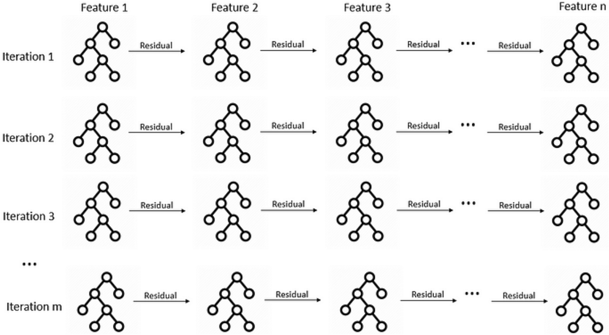
At their core, EBMs work by learning how each individual feature affects the prediction, one at a time. Here’s a deeper look at how they work:
Feature Functions: For each feature X, EBM learns a function
f(X)that captures that feature’s contribution to the prediction. These functions are flexible and can model complex non-linear relationships.Cyclic Training: The model cycles through features repeatedly:
- For each feature, it fits a small number of trees (usually 1-4)
- These trees learn the residual error not captured by other features
- The process repeats until convergence
Additive Structure: The final prediction is the sum of all feature functions:
prediction = intercept + f1(X1) + f2(X2) + ... + fn(Xn)Regularization: EBMs use techniques like early stopping and small learning rates to prevent overfitting while maintaining interpretability.
This architecture allows EBMs to achieve accuracy comparable to random forests or gradient boosting machines, while keeping every component transparent and interpretable. You can examine exactly how each feature contributes, identify potential biases, and explain predictions to stakeholders.
Look at this video to get a better understanding of how EBMs work: The Science Behind InterpretML: Explainable Boosting Machine
Hands-On Tutorial:
Downloading the dataset:
For this tutorial, we’ll be using the Heart Failure Prediction dataset from Kaggle. To download it, you’ll need a Kaggle account and API credentials. Here’s how to set it up:
- Create a Kaggle account at kaggle.com if you don’t have one
- Go to your account settings (click on your profile picture → Account)
- Scroll down to “API” section and click “Create New API Token”
- This will download a
kaggle.jsonfile - place it in~/.kaggle/on Linux/Mac orC:\Users\<Windows-username>\.kaggle\on Windows.
Once set up, you can download the dataset using the Kaggle API. We’ll show the code for this in the next cell.
# Download latest version
path = kagglehub.dataset_download("fedesoriano/heart-failure-prediction")

print("Path to dataset files:", path)
Path to dataset files: /Users/mehuljain/.cache/kagglehub/datasets/fedesoriano/heart-failure-prediction/versions/1Let’s load the dataset:
df= pd.read_csv(path + "/heart.csv")
df.head()| Age | Sex | ChestPainType | RestingBP | Cholesterol | FastingBS | RestingECG | MaxHR | ExerciseAngina | Oldpeak | ST_Slope | HeartDisease | |
|---|---|---|---|---|---|---|---|---|---|---|---|---|
| 0 | 40 | M | ATA | 140 | 289 | 0 | Normal | 172 | N | 0.0 | Up | 0 |
| 1 | 49 | F | NAP | 160 | 180 | 0 | Normal | 156 | N | 1.0 | Flat | 1 |
| 2 | 37 | M | ATA | 130 | 283 | 0 | ST | 98 | N | 0.0 | Up | 0 |
| 3 | 48 | F | ASY | 138 | 214 | 0 | Normal | 108 | Y | 1.5 | Flat | 1 |
| 4 | 54 | M | NAP | 150 | 195 | 0 | Normal | 122 | N | 0.0 | Up | 0 |
The dataset contains various medical features that can be used to predict heart disease:
- Age: Age of the patient in years
- Sex: Gender of the patient (M/F)
- ChestPainType: Type of chest pain (ATA: Atypical Angina, NAP: Non-Anginal Pain, ASY: Asymptomatic, TA: Typical Angina)
- RestingBP: Resting blood pressure in mm Hg
- Cholesterol: Serum cholesterol in mm/dl
- FastingBS: Fasting blood sugar > 120 mg/dl (1 = true; 0 = false)
- RestingECG: Resting electrocardiogram results (Normal, ST: having ST-T wave abnormality, LVH: showing probable or definite left ventricular hypertrophy)
- MaxHR: Maximum heart rate achieved during exercise
- ExerciseAngina: Exercise-induced angina (Y/N)
- Oldpeak: ST depression induced by exercise relative to rest
- ST_Slope: Slope of the peak exercise ST segment (Up, Flat, Down)
- HeartDisease: Target variable, indicates presence of heart disease (1 = yes, 0 = no)
Using these features, we’ll train an Explainable Boosting Machine (EBM) to predict whether a patient is likely to have heart failure.
Exploratory Data Analysis:
Let’s start by exploring the dataset with some basic visualizations and statistics.
# Check for missing values
missing_values = df.isnull().sum()
# Check for class imbalance
class_counts = df['HeartDisease'].value_counts()
# Visualize class distribution
plt.figure(figsize=(10, 6))
plt.hist(df['HeartDisease'], bins=2, rwidth=0.8)
plt.title('Distribution of Heart Disease Cases')
plt.xlabel('Heart Disease (0 = No, 1 = Yes)')
plt.ylabel('Count')
plt.show()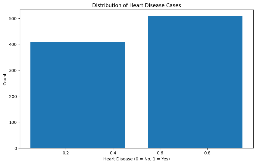
Looking at the class distribution, we can see that the dataset is relatively balanced between patients with and without heart disease. This is good news for our modeling efforts, as we won’t need to employ any special techniques to handle class imbalance. The roughly equal distribution also means our model will have sufficient examples of both positive and negative cases to learn from, which should help in achieving good predictive performance for both classes.
Next, we’ll analyze the mutual information between our features and the target variable. Mutual information (MI) is a measure from information theory that quantifies the mutual dependence between two variables - specifically, it measures how much information one variable provides about another.
When used in feature analysis, MI helps us understand: 1. The strength of the relationship between each feature and the target variable (HeartDisease) 2. The amount of uncertainty about the target that is reduced by knowing a feature 3. Non-linear relationships that might not be captured by simpler correlation metrics
Unlike correlation coefficients, mutual information: - Can detect non-linear relationships - Is always non-negative (0 indicates no mutual information, higher values indicate stronger relationships) - Doesn’t assume any particular distribution of the variables
X = df.copy()
y = X.pop("HeartDisease")

# Label encoding for categoricals
for colname in X.select_dtypes("object"):
    X[colname], _ = X[colname].factorize()

discrete_features = X.dtypes == int
def make_mi_scores(X, y, discrete_features):
mi_scores = mutual_info_classif(X, y, discrete_features=discrete_features)
mi_scores = pd.Series(mi_scores, name="MI Scores", index=X.columns)
mi_scores = mi_scores.sort_values(ascending=False)
return mi_scores
mi_scores = make_mi_scores(X, y, discrete_features)
mi_scores[::3]Cholesterol 0.223062
ChestPainType 0.155988
Age 0.073583
FastingBS 0.038040
Name: MI Scores, dtype: float64Now, let’s plot the MI scores for each feature:
def plot_mi_scores(scores):
    scores = scores.sort_values(ascending=True)
    width = np.arange(len(scores))
    ticks = list(scores.index)
    plt.barh(width, scores)
    plt.yticks(width, ticks)
    plt.title("Mutual Information Scores")


plt.figure(dpi=100, figsize=(8, 5))
plot_mi_scores(mi_scores)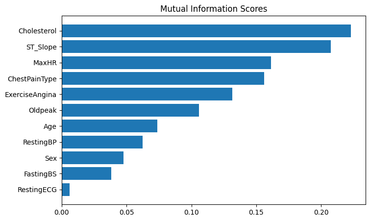
mi_scoresCholesterol 0.223062
ST_Slope 0.207474
MaxHR 0.161544
ChestPainType 0.155988
ExerciseAngina 0.131680
Oldpeak 0.105685
Age 0.073583
RestingBP 0.062498
Sex 0.047477
FastingBS 0.038040
RestingECG 0.006045
Name: MI Scores, dtype: float64The mutual information scores reveal several interesting insights about our heart disease dataset:
- Cholesterol has the highest MI score (0.22), indicating it has the strongest relationship with heart disease
- ST_Slope is the second most informative feature (0.20), suggesting different types of slope at peak exercise ST segment are important predictors.
- Age has a moderate relationship (0.07) with heart disease outcomes.
- FastingBS (blood sugar) shows a weaker but still notable relationship (0.04).
This suggests that cholesterol levels, ST_Slope, maximum heart rate achieved during exercise and chest pain characteristics should be key features to focus on in our model. The relatively lower scores for age and blood sugar indicate they may be less predictive, though still potentially useful.
Can we look at some box plots to confirm the relationship between the features and the target variable?
# Create box plots to better show the relationship between features and heart disease
plt.figure(figsize=(15, 5))

# Plot Cholesterol distribution by Heart Disease
plt.subplot(131)
df.boxplot(column='Cholesterol', by='HeartDisease', ax=plt.gca())
plt.xlabel('Heart Disease')
plt.ylabel('Cholesterol')
plt.title('Cholesterol Distribution by Heart Disease')

# Plot MaxHR distribution by Heart Disease
plt.subplot(132)
df.boxplot(column='MaxHR', by='HeartDisease', ax=plt.gca())
plt.xlabel('Heart Disease')
plt.ylabel('Max Heart Rate')
plt.title('Max Heart Rate Distribution by Heart Disease')

# Plot Age distribution by Heart Disease
plt.subplot(133)
df.boxplot(column='Age', by='HeartDisease', ax=plt.gca())
plt.xlabel('Heart Disease')
plt.ylabel('Age')
plt.title('Age Distribution by Heart Disease')

plt.tight_layout()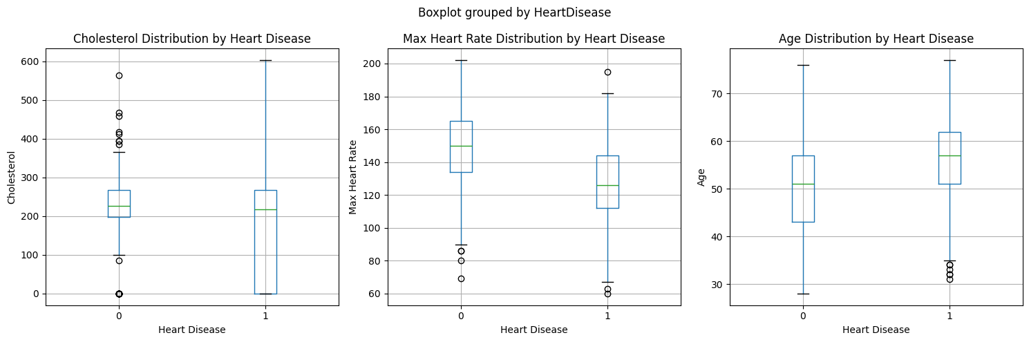
These visualizations support the mutual information scores we saw earlier, particularly for cholesterol and max heart rate being important predictors.
Note: The significant overlap in the cholesterol boxplots between those with and without heart disease is noteworthy. This overlap could be explained by several factors:
- Treatment Effect: Many patients may already be on cholesterol-lowering medications (like statins), which could artificially lower their cholesterol levels despite having heart disease. This medical intervention likely creates a broader range and more overlap between the groups.
- Complex Relationship: While high cholesterol is a risk factor for heart disease, the relationship isn’t perfectly linear - other factors like HDL vs LDL ratios, genetics, and lifestyle factors all play important roles.
- Temporal Aspect: The cholesterol measurements represent a snapshot in time and may not reflect the historical cholesterol levels that contributed to heart disease development.
This overlap emphasizes why we need to consider multiple features together rather than relying on any single measurement for heart disease prediction.
Model Building:
Before building the model, we need to preprocess the data. So, what about it?
Explainable Boosting Machines (EBMs) handle preprocessing internally in an intelligent way:
- Categorical features are automatically label encoded
- Continuous features are binned intelligently during training
- Missing values are handled automatically
- Feature scaling is not required since EBMs learn optimal feature transformations
This means we can use our raw data directly without extensive preprocessing, which is one of the advantages of using EBMs. The model will learn the appropriate transformations for each feature during training while maintaining interpretability.
Isn’t this cool? 🤯
# one look at the data before we build the model
df.head()| Age | Sex | ChestPainType | RestingBP | Cholesterol | FastingBS | RestingECG | MaxHR | ExerciseAngina | Oldpeak | ST_Slope | HeartDisease | |
|---|---|---|---|---|---|---|---|---|---|---|---|---|
| 0 | 40 | M | ATA | 140 | 289 | 0 | Normal | 172 | N | 0.0 | Up | 0 |
| 1 | 49 | F | NAP | 160 | 180 | 0 | Normal | 156 | N | 1.0 | Flat | 1 |
| 2 | 37 | M | ATA | 130 | 283 | 0 | ST | 98 | N | 0.0 | Up | 0 |
| 3 | 48 | F | ASY | 138 | 214 | 0 | Normal | 108 | Y | 1.5 | Flat | 1 |
| 4 | 54 | M | NAP | 150 | 195 | 0 | Normal | 122 | N | 0.0 | Up | 0 |
Splitting the data into train and test sets:
X = df.iloc[:, :-1]
y = df.iloc[:, -1]

seed = 42
np.random.seed(seed)
X_train, X_test, y_train, y_test = train_test_split(X, y, test_size=0.20, random_state=seed)
Let’s train a simple EBM model:
ebm = ExplainableBoostingClassifier()
ebm.fit(X_train, y_train)
/Users/mehuljain/miniconda3/envs/aaamlp/lib/python3.10/site-packages/pandas/core/arrays/masked.py:60: UserWarning: Pandas requires version '1.3.6' or newer of 'bottleneck' (version '1.3.5' currently installed).
from pandas.core import (
/Users/mehuljain/miniconda3/envs/aaamlp/lib/python3.10/site-packages/pandas/core/arrays/masked.py:60: UserWarning: Pandas requires version '1.3.6' or newer of 'bottleneck' (version '1.3.5' currently installed).
from pandas.core import (
/Users/mehuljain/miniconda3/envs/aaamlp/lib/python3.10/site-packages/pandas/core/arrays/masked.py:60: UserWarning: Pandas requires version '1.3.6' or newer of 'bottleneck' (version '1.3.5' currently installed).
from pandas.core import (
/Users/mehuljain/miniconda3/envs/aaamlp/lib/python3.10/site-packages/pandas/core/arrays/masked.py:60: UserWarning: Pandas requires version '1.3.6' or newer of 'bottleneck' (version '1.3.5' currently installed).
from pandas.core import (
/Users/mehuljain/miniconda3/envs/aaamlp/lib/python3.10/site-packages/pandas/core/arrays/masked.py:60: UserWarning: Pandas requires version '1.3.6' or newer of 'bottleneck' (version '1.3.5' currently installed).
from pandas.core import (
/Users/mehuljain/miniconda3/envs/aaamlp/lib/python3.10/site-packages/pandas/core/arrays/masked.py:60: UserWarning: Pandas requires version '1.3.6' or newer of 'bottleneck' (version '1.3.5' currently installed).
from pandas.core import (
/Users/mehuljain/miniconda3/envs/aaamlp/lib/python3.10/site-packages/pandas/core/arrays/masked.py:60: UserWarning: Pandas requires version '1.3.6' or newer of 'bottleneck' (version '1.3.5' currently installed).
from pandas.core import (
/Users/mehuljain/miniconda3/envs/aaamlp/lib/python3.10/site-packages/pandas/core/arrays/masked.py:60: UserWarning: Pandas requires version '1.3.6' or newer of 'bottleneck' (version '1.3.5' currently installed).
from pandas.core import (ExplainableBoostingClassifier()In a Jupyter environment, please rerun this cell to show the HTML representation or trust the notebook.
On GitHub, the HTML representation is unable to render, please try loading this page with nbviewer.org.
ExplainableBoostingClassifier()
How does it perform?
auc = roc_auc_score(y_test, ebm.predict_proba(X_test)[:, 1])
print("AUC: {:.3f}".format(auc))

# Calculate additional metrics
accuracy = accuracy_score(y_test, ebm.predict(X_test))
precision = precision_score(y_test, ebm.predict(X_test))
recall = recall_score(y_test, ebm.predict(X_test))
f1 = f1_score(y_test, ebm.predict(X_test))

print("Accuracy: {:.3f}".format(accuracy))
print("Precision: {:.3f}".format(precision))
print("Recall: {:.3f}".format(recall))
print("F1 Score: {:.3f}".format(f1))
AUC: 0.931
Accuracy: 0.870
Precision: 0.903
Recall: 0.869
F1 Score: 0.886Looking at multiple performance metrics gives us a more comprehensive view of our model’s capabilities. While AUC-ROC (0.931) shows strong overall discriminative ability, examining accuracy (0.87), precision (0.90), recall (0.86), and F1-score (0.88) provides deeper insights:
- AUC-ROC indicates strong ability to distinguish between classes
- Accuracy tells us the overall correctness of predictions
- Precision shows how many of our positive predictions were actually correct
- Recall indicates how many actual positive cases we caught
- F1-score balances precision and recall
This multi-metric approach is especially important for medical applications like heart disease prediction, where different types of errors (false positives vs false negatives) can have varying consequences. A model might have high accuracy but poor recall, potentially missing critical cases that require medical attention.
Interpreting the Model:
Now that we have our model, we can interpret the results and look behind the scenes to see how it’s making predictions.
Let’s start by looking at the global interpretation of the model.
What is global interpretation?
Global interpretations help us understand the model’s behavior as a whole. It gives us a clear picture of the model’s strengths and weaknesses, and how it makes predictions. The initial plot is a good starting point to get an overview of the model’s behavior. To dig deeper, we can use the drop-down menu to search, filter and see how individual features contribute to the model’s predictions.
show(ebm.explain_global())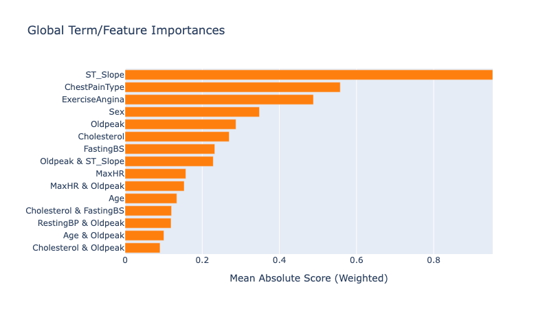
Looking at the summary plot, we can derive the following insights:
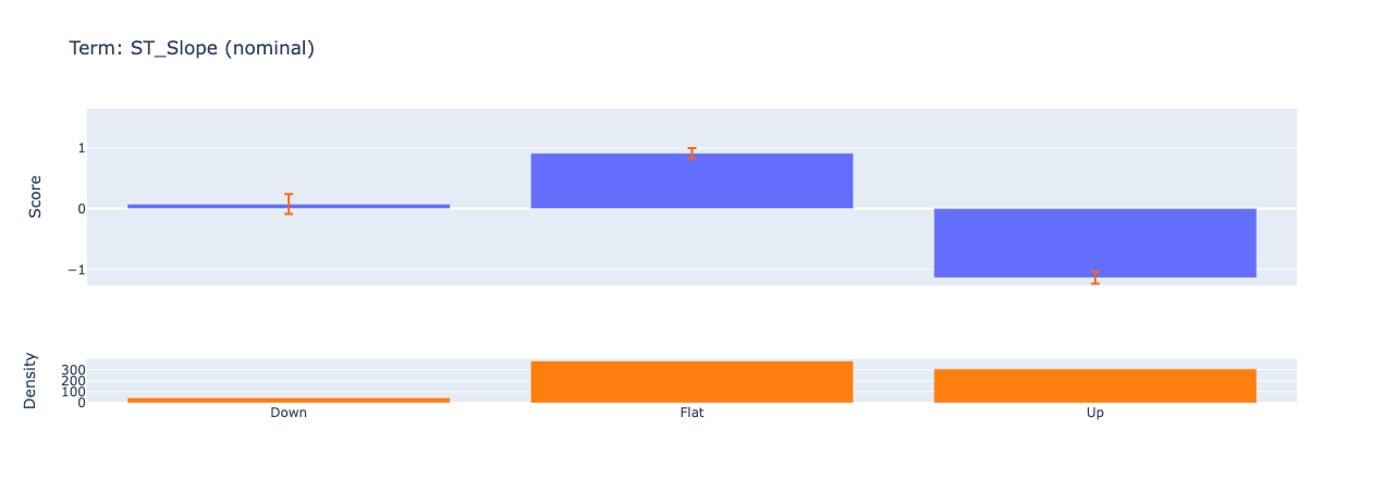
ST Slope has the highest impact on predictions, suggesting it’s the strongest predictor of heart disease. This makes sense given that the ST_Slope feature represents the slope of the peak exercise ST segment. If we dig deeper in the individual feature contribution, we see that the model has learned how different reading on the ECG can impact the prediction. From some research online, I found the following:
- Upsloping: ST segment rises ≥1 mm above baseline within 80 ms of the J-point (normal response).
- Flat: Horizontal ST segment (indeterminate or borderline ischemia).
- Downsloping: ST segment descends below baseline (highly suggestive of ischemia or infarction).
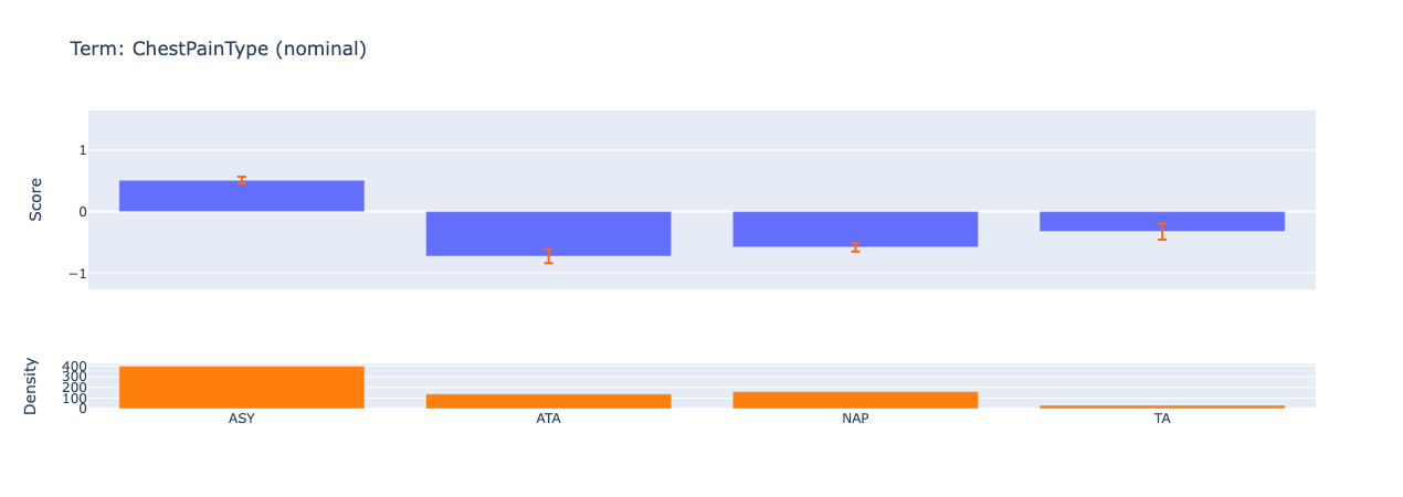
ChestPainType is the second strongest predictor of heart disease. We can observe how the model gives a higher score to ASY (asymptomatic) chest pain type which hints at the possibility of silent ischemia.
Another interesting observation is that the model also includes interaction terms between features. For example, the model has learned that the combination of ST_Slope and Oldpeak can impact the prediction. Medical professionals can use this information to better assess patient risk, especially in cases where traditional indicators might be ambiguous.
Another reason why EBMs/interpretable models are so powerful is that they can help us find the bias in the data. For example, we can see that the model is biased towards predicting heart disease for males. This is likely due to the fact that the dataset is imbalanced and has more males than females. More specifically, the dataset has more males with heart disease than females.
After getting the overview of the model, we can inspect the local explanations to see how individual predictions are made. For EBMs, these explanations are exact and perfectly describe how the model made the decision. These explanations are great for describing to the end users which features played the biggest role in a given prediction.
show(ebm.explain_local(X_test[:5], y_test[:5]), 0)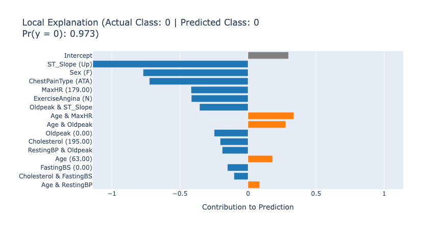
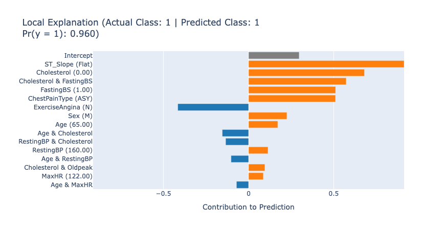
The local explanations for the first 5 test samples tell us how the model arrived at each prediction. For example, in the first case, the model predicted no heart disease (score: 0.97) primarily due to the patient’s normal ST_Slope (Up) and low Oldpeak value. This kind of detailed information can lead to new knowledge that helps the medical professionals understand and assess the patient’s risk accurately.
Comparing EBM’s performance with other models:
In this section, we’ll compare the performance of EBM’s with other popular tree-based models:
- Random Forest: An ensemble learning method that operates by constructing multiple decision trees and outputting the mean prediction of the individual trees. Random forests are known for:
- High accuracy and good generalization
- Ability to handle both numerical and categorical features
- Built-in feature importance measures
- XGBoost: A highly optimized gradient boosting framework that has dominated many machine learning competitions. XGBoost is popular for:
- Superior predictive accuracy
- Fast training and inference speed
- Effective handling of missing values
Both models are strong baselines for tabular data problems like our heart disease prediction task. However, unlike EBM, these models are considered “black box” as their predictions are not as easily interpretable. By comparing their performance metrics with EBM, we can evaluate whether we’re sacrificing predictive power for interpretability.
# Preprocess categorical variables
categorical_features = ['Sex', 'ChestPainType', 'RestingECG', 'ExerciseAngina', 'ST_Slope']
X_train_encoded = pd.get_dummies(X_train, columns=categorical_features)
X_test_encoded = pd.get_dummies(X_test, columns=categorical_features)

# Ensure test set has same columns as train set
missing_cols = set(X_train_encoded.columns) - set(X_test_encoded.columns)
for col in missing_cols:
    X_test_encoded[col] = 0
X_test_encoded = X_test_encoded[X_train_encoded.columns]

# Convert to numpy arrays
X_train_encoded_np = X_train_encoded.to_numpy()
X_test_encoded_np = X_test_encoded.to_numpy()

# Train Random Forest
rf = RandomForestClassifier(n_estimators=100, random_state=42)
rf.fit(X_train_encoded, y_train)

# Train XGBoost
xgb_model = xgb.XGBClassifier(random_state=42)
xgb_model.fit(X_train_encoded_np, y_train)

# Get predictions
rf_pred = rf.predict(X_test_encoded)
rf_pred_proba = rf.predict_proba(X_test_encoded)[:,1]

xgb_pred = xgb_model.predict(X_test_encoded_np)
xgb_pred_proba = xgb_model.predict_proba(X_test_encoded_np)[:,1]

# Calculate metrics
print("Random Forest Performance:")
print(f"Accuracy: {accuracy_score(y_test, rf_pred):.3f}")
print(f"ROC AUC: {roc_auc_score(y_test, rf_pred_proba):.3f}")
print("\nXGBoost Performance:")
print(f"Accuracy: {accuracy_score(y_test, xgb_pred):.3f}")
print(f"ROC AUC: {roc_auc_score(y_test, xgb_pred_proba):.3f}")
[22:00:31] WARNING: /var/folders/nz/j6p8yfhx1mv_0grj5xl4650h0000gp/T/abs_eek2t0c4ro/croots/recipe/xgboost-split_1659548960591/work/src/learner.cc:1115: Starting in XGBoost 1.3.0, the default evaluation metric used with the objective 'binary:logistic' was changed from 'error' to 'logloss'. Explicitly set eval_metric if you'd like to restore the old behavior.
Random Forest Performance:
Accuracy: 0.880
ROC AUC: 0.944
XGBoost Performance:
Accuracy: 0.875
ROC AUC: 0.932Voila! Looking at the performance metrics above, we can see that EBM achieves comparable accuracy and ROC AUC scores to both Random Forest and XGBoost models. This is quite remarkable, as EBMs manage to maintain competitive predictive power while offering much greater interpretability.
Interpretable, not Explainable:
You may have noticed the frequent use of the term “interpretable” throughout this blog post. Similarly, “explainable” is another buzzword that often crops up in discussions about AI and machine learning. While these terms are often used interchangeably, there’s a subtle yet significant difference between them that’s worth exploring.
Interpretable models, like EBMs, are inherently transparent - their inner workings can be directly understood by examining how they process inputs to arrive at outputs. The logic they use is clear and accessible by design. In contrast, explainable models start as “black boxes” and require post-hoc explanation techniques to understand their decisions.
For example, let’s talk about some popular explanation techniques like SHAP (SHapley Additive exPlanations) and LIME (Local Interpretable Model-agnostic Explanations). SHAP uses game theory concepts to attribute importance to each feature for a specific prediction. LIME creates a simpler, interpretable model that approximates the complex model’s behavior in the local region around a prediction.
Explainability is very useful in certain cases, but it has its own set of limitations:
- Fidelity Issues: The explanations may not perfectly reflect the actual model’s reasoning.
- Stability: Different explanation techniques can provide inconsistent or contradictory explanations, especially for smaller datasets.
- Computational Cost: Generating explanations often requires significant computational resources.
- False Confidence: Explanations can give a false sense of understanding while missing crucial model behaviors.
- Local vs Global: Many techniques only explain individual predictions, not the model’s overall behavior.
This is why truly interpretable models like EBMs are particularly valuable - they don’t require these additional explanation layers because their decision-making process is transparent from the start. The interpretability is built into the model architecture itself, rather than being retrofitted through external explanation techniques.
EBMs, Interpretable ML and the Future of Machine Learning:
In this blog post, we learned about EBMs through a hands-on tutorial. We saw how they can used to create new knowledge and actionable insights from data while maintaining a high predictive power. But as we stand at the precipice of a machine learning revolution, one question looms: What comes next?
The Transparency Imperative:
The rapid adoption of ML across industries—from healthcare diagnostics to financial forecasting—has exposed a critical bottleneck: the opacity of “black-box” models. Stakeholders increasingly demand transparency to validate decisions, comply with regulations, and build trust. This is where EBMs and similar interpretable architectures will shine. By design, they reveal how and why predictions are made, bridging the gap between technical teams and decision-makers.
The Paradox of Scale- Large Models, Larger Questions:
While trillion-parameter language models dazzle the world with their capabilities, their inner workings remain shrouded in mystery. As these systems grow more powerful and more embedded in high-stakes domains, the need for interpretability becomes urgent. How do we audit models that even their creators struggle to fully comprehend? How do we ensure they align with human values?
This challenge extends far beyond EBMs. Interpretability is not a feature—it’s a fundamental requirement for ethical AI. It represents a collective journey for researchers, developers, and policymakers to reimagine ML systems as collaborators rather than oracles.
Beyond Predictions- AI as a Knowledge Engine:
The true promise of interpretable models lies in their ability to generate genuine knowledge. In healthcare, EBMs might uncover previously overlooked risk factors; in climate science, they could decode complex environmental interactions. Unlike black-box systems that simply output decisions, these models contribute to human understanding by revealing patterns and relationships within data.
A Blueprint for Tomorrow’s AI:
The path forward is clear:
- Prioritize transparency without sacrificing performance.
- Demystify complex models through rigorous interpretability research.
- Empower stakeholders with tools to interrogate and learn from AI.
As we chart this course, models like EBMs offer more than just a technical solution—they exemplify a philosophical shift. The future of AI isn’t just about automating tasks; it’s about creating systems that augment human expertise through clarity and collaboration.
This is the frontier of machine learning: models that don’t just predict the world, but help us understand it.